So I have been drawing heavily on the excellent activities there. Some tasks I use almost verbatim, and others I modify to suit my own purposes. One of the activities I found was a nice math modeling activity called "In the Cups". It is designed to support students with creating and using linear models to make predictions and solve problems.
The original document presents the following data to students:
| Number of Cups | Height of stack (in cm) |
| 1 | 7 |
| 2 | 7.6 |
| 3 | 8.2 |
| 4 | 8.7 |
| 5 | 9.2 |
| 7 | 10.1 |
| 8 | 10.6 |
I noticed that the data in the table do not quite conform to a perfectly linear relationship--notice that the unit rate of change varies from 0.6cm to 0.5cm per cup--which got me thinking. I wondered if the author had introduced some random variation into the stack heights presented in the table in attempt to make the task seem more authentic. Or perhaps he or she had really measured some cups and the data were authentic approximations. Either way, I liked it.
I started measuring a stack of dixie cups I had in my office, then I realized that by doing the measuring myself, I was about to rob my students them of an opportunity to do some critical thinking. So I decided to replace the table of values with a photograph.
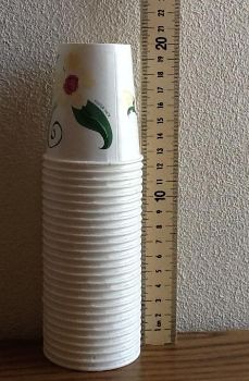
That one picture (of 27 cups) contains all of the information needed to model the relationship, and it invites students to consider questions about the accuracy of the approximation. Replacing the table with the photograph felt like a more authentic way to present the task to my students.
For the sake of consistency (which you may read as: to make it easier to grade), I decided to add a bit more support. I included two additional "close-ups" showing some of the relevant measurements. In hindsight, I wonder how my students would have handled the greater ambiguity offered by just the one photo without the extra support... hmm, something to explore next time.
By replacing the table of values with a photograph, I was able to tweak the task in a way that focused on the same learning targets while making the task slightly more authentic, and that felt like a nice move to make. In a future post, I'll talk a bit about some of the thinking my students shared with me in response to the questions I posed. (To wet your whistle: Some students found the slope to be 0.474 -- can you spot their mistake? Would they have made that mistake if they were given a table of values? Is that a good thing?)
For now, you can access the completed worksheet below, including the relevant learning targets I had in mind for the various parts of the task.
No comments:
Post a Comment